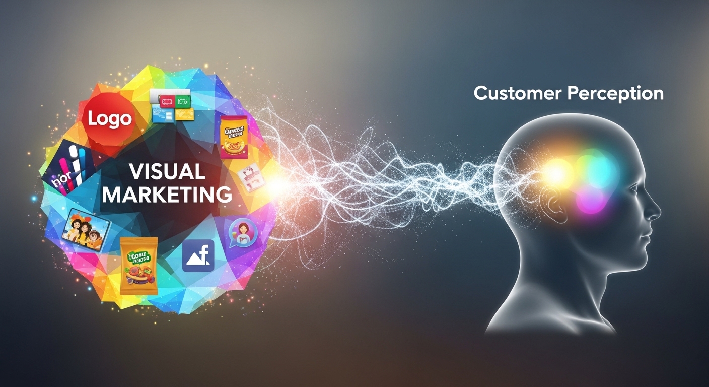
Visual marketing often speaks before a single word is read. From a storefront poster to a social media graphic, customers form impressions in seconds—deciding whether a business feels credible, relevant, and worth their time. For small businesses, especially, thoughtful visual choices can be the difference between being noticed or overlooked. Understanding how visual marketing shapes customer perception helps brands communicate trust, value, and professionalism at first glance.
Why First Impressions Are Visual
Human brains process images faster than text. Color, layout, and imagery are absorbed almost instantly, setting expectations about quality and reliability. A clean, well-designed visual suggests organization and competence, while cluttered or inconsistent visuals can raise doubts—even if the product or service itself is solid.
This is why visual marketing isn’t just about aesthetics. It’s a strategic tool that influences how customers feel before they ever engage further.
The Building Blocks of Effective Visual Marketing
Color and Contrast
Color plays a powerful psychological role. Warm tones can create energy and urgency, while cooler tones often convey calm and trust. High contrast improves readability and ensures key messages stand out. Poor contrast, on the other hand, can make visuals hard to read and easy to ignore.
Consistent color use across materials also reinforces brand recognition. When customers repeatedly see the same palette, it builds familiarity and confidence.
Typography and Readability
Fonts communicate personality. A clean, legible typeface suggests professionalism, while overly decorative fonts can distract from the message. Readability matters even more in physical marketing, where viewers may only glance briefly at a poster or sign.
Clear hierarchy—using size and weight to guide the eye—helps customers quickly understand what’s most important.
Visual Hierarchy and Layout
Strong visual marketing directs attention intentionally. Headlines should stand out first, followed by supporting details and branding. White space isn’t wasted space; it gives the design room to breathe and helps key elements stand out.
When layout feels intuitive, customers don’t have to work to understand the message—and that ease translates into a more positive perception of the brand.
Real-World Visual Touchpoints That Shape Perception
Visual marketing shows up everywhere customers interact with a business. Posters in windows, store signage, packaging, menus, and even printed handouts all contribute to the overall impression.
For example, a thoughtfully designed poster with a clear headline, compelling imagery, and balanced layout signals professionalism and attention to detail. Understanding what makes a great business poster fits into the broader goal of visual clarity—delivering a message that’s easy to notice, understand, and trust.
These same principles apply across channels. A business that maintains consistent visuals from physical materials to digital platforms appears more established and reliable.
How Visual Quality Builds Trust
Customers often equate visual quality with business quality. Professionally designed materials suggest that a business cares about details and invests in its brand. This perception can influence whether someone walks through the door, scans a QR code, or remembers the brand later.
In contrast, low-quality visuals—blurry images, mismatched fonts, or crowded layouts—can unintentionally signal inexperience or lack of credibility. Even small improvements in design quality can noticeably improve how a business is perceived.
Practical Ways Small Businesses Can Improve Visual Marketing
Improving visual marketing doesn’t require a large budget. Small changes can have an outsized impact:
- Simplify messages so each visual has one clear purpose.
- Use consistent colors and fonts across all materials.
- Prioritize readability, especially for headlines and calls to action.
- Choose high-quality images that reflect the brand’s tone and audience.
Testing visuals in real-world settings also helps. Viewing a poster from a distance or on a busy street can reveal whether the message stands out or gets lost.
Consistency Creates Recognition
Consistency is one of the most underestimated aspects of visual marketing. When customers see the same visual cues repeatedly, it reinforces memory and trust. Over time, consistent design builds a recognizable identity that feels familiar and dependable.
This consistency should extend across physical and digital marketing, creating a seamless experience no matter where customers encounter the brand.
A Lasting Impression That Drives Action
Visual marketing shapes customer perception long before a conversation begins. By focusing on clarity, quality, and consistency, businesses can create visuals that not only attract attention but also build trust and confidence.
Thoughtful visual choices make it easier for customers to understand what a business offers and why it’s worth engaging with. In a crowded marketplace, that positive first impression can be the start of a lasting relationship—and a powerful step toward long-term growth.